The US continues to run massive trade deficits. Despite the lack of interest in the mainstream, trade deficits matter. And as Peter Schiff said last fall, we can’t just ignore these trade deficits forever.
February did not set a new monthly trade deficit record, but it was very close, and it was worse than projected.
The Net Deficit came in at -$89.18 compared to the record in January of -$89.23B. But we did set a new trailing 12-month (TTM) record in February, and the deficit relative to GDP is surging. More on this below.
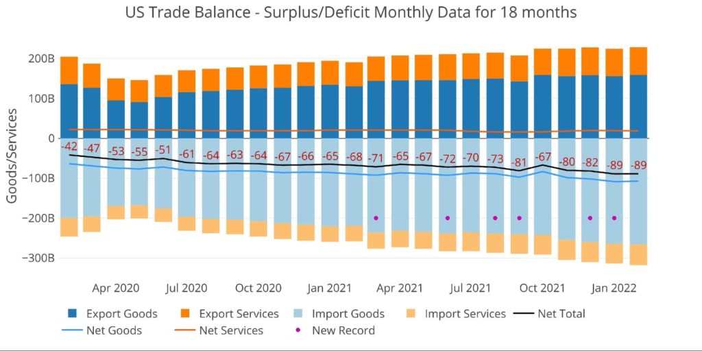
Figure: 1 Monthly Plot Detail
The table below provides detail.
Monthly Trade Deficit
- The Net Deficit only shrunk because Exports grew slightly faster than Imports
- Total Imports still increased by $4B MoM
- On a YoY basis, Total Imports have increased 23.1% from $258B to $318B
- The Services Surplus shrunk by 5.6% from $19.4B to $18.3B
- This means the difference was really made up in Exported Goods
Looking at Trailing Twelve-Month:
- The Total Net Deficit did reach a new record of $908B
- This shattered the record last month by $22B
- YoY, the Net Deficit is up 25.6% from $722B
- For comparison, the Feb 2020 (pre-Covid) the TTM was only $566B
- The TTM Services Surplus has fallen 7.1% from $243B to $226B over the last year
- Over that time, the Goods Deficit has increased 17.4% from $965B to $1.13T
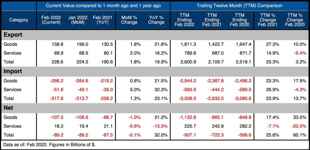
Figure: 2 Trade Balance Detail
Historical Perspective
Zooming out and focusing on the Net numbers shows the longer-term trend and shows the magnitude of the current move. This plot also shows how much larger the Goods Deficit is compared to the Services Surplus. The Services Surplus has been declining since Jan 2018.
The recent uptick in the Services Surplus can be seen on the far right. Unfortunately, this uptick has already started to reverse. The Goods Deficit can also be seen plunging dramatically.
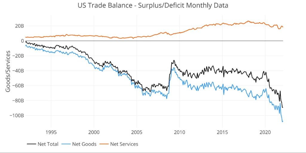
Figure: 3 Historical Net Trade Balance
The chart below zooms in on the Services Surplus to show the wild ride it has been on in recent months. It compares Net Services to Total Exported Services to show relative size. After hovering near 35% since 2013, it dropped to 24.9% in Oct 2021, recovered to 28%, but has fallen back down to 26.2%.
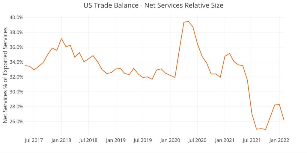
Figure: 4 Historical Services Surplus
To put it all together and remove some of the noise, the next plot below shows the Trailing Twelve Month (TTM) values for each month (i.e., each period represents the summation of the previous 12-months).
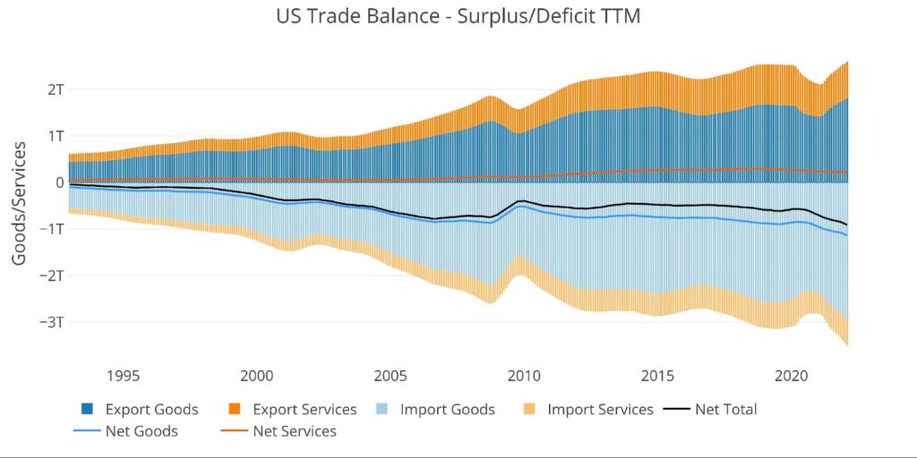
Figure: 5 Trailing 12 Months (TTM)
Although the Net Trade Deficits are hitting all-time records in dollar terms, it can be put in perspective by comparing the value to US GDP. As the chart below shows, the current records are still below the 2006 highs before the Great Financial Crisis.
That being said, the current 3.78% is the highest since May of 2009 and up from 2.93% in October.
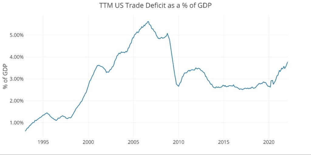
Figure: 6 TTM vs GDP
The chart below shows the YTD values. Because the current month is February, this chart only shows two months, but already 2022 is well above prior years by a significant margin.
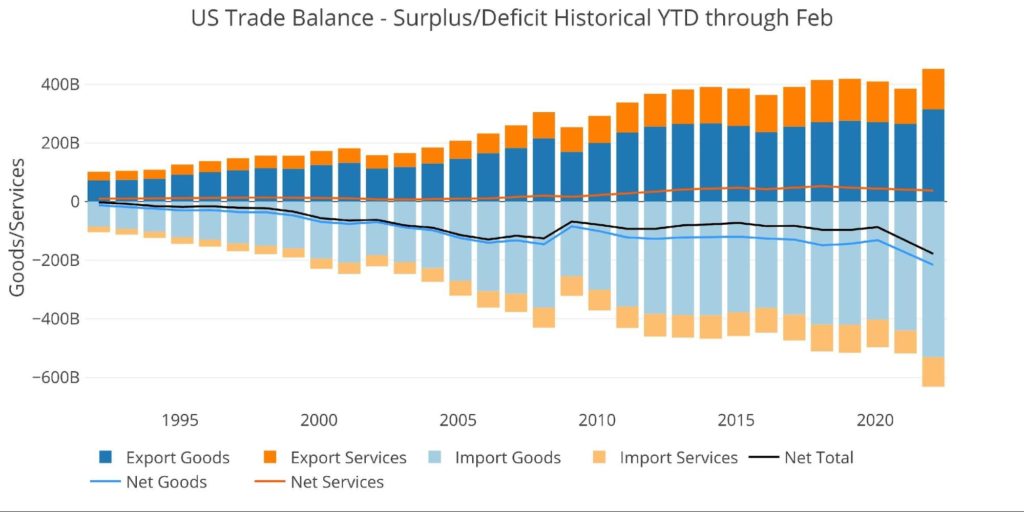
Figure: 7 Year to Date
What It Means for Gold and Silver
It’s very possible the coming months could see a reduction in the Trade Deficit as the Russian/Ukraine situation starts to become visible in the data. That being said, it won’t matter as it will be a temporary reprieve if any even materializes.
The US continues to run massive deficits with its trading partners. After weaponizing the dollar against Russia, how long until other countries become tired of sending physical goods for printed paper. If other countries get tired of holding so many dollars, it could cause a rapid decline in the value of the dollar. Gold and silver are the true universal currency of the world and offer great protection against such an event.
Data Source: https://fred.stlouisfed.org/series/BOPGSTB
Data Updated: Monthly on one month lag
Last Updated: Apr 05, 2022, for Feb 2022
US Debt interactive charts and graphs can always be found on the Exploring Finance dashboard: https://exploringfinance.shinyapps.io/USDebt/


