The March trade deficit came in at -$110B. This obliterated the February record trade deficit of $90B. As the chart below shows, the trade deficit has set a record in each of the last 4 months. It was creeping upwards from -$80B to -$90B before exploding in the latest month.
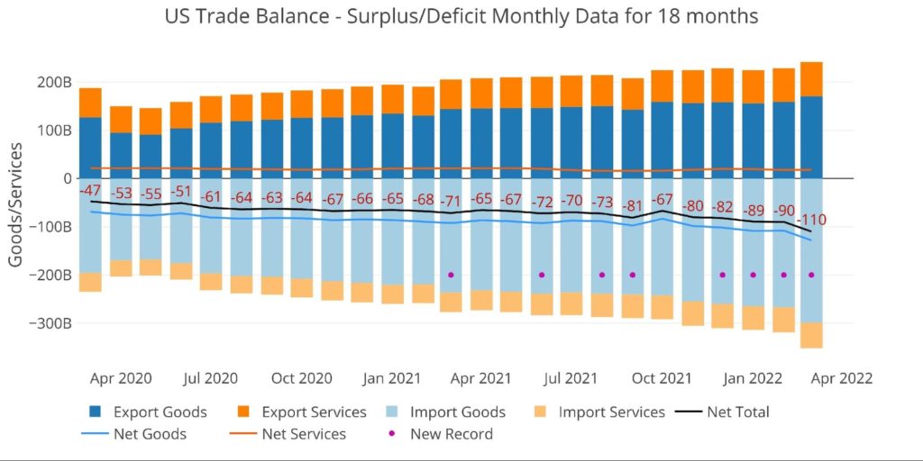
Figure: 1 Monthly Plot Detail
The table below provides detail.
Monthly Trade Deficit
- Exports grew in both Goods (+7.3%) and Services (+1.8%)
-
- Imports grew faster in Goods (12%) but slower in Services (1.7%)
- The growth on Goods is such a big number (-$267B) that it more than doubled the total growth in Exports
-
- On a Net basis, the Goods Deficit surged 18.9% against only a 2% growth in the Services Surplus
-
- The total deficit grew 22.3%
-
- The only number shrinking YoY is the Services Surplus – this is bad
Looking at Trailing Twelve Month:
- The Total Net Deficit reached a new record of $946B
-
- This shattered the $907B record last month by almost $40B
- YoY, the Net Deficit is up 26.7%
- Compared to March 2020, the TTM Deficit is up 67.8%
-
- The TTM Services Surplus has fallen 8.1% from $242B to $222B over the last year
-
- Over that time, the Goods Deficit has increased 18.2% from $988B to $1.17T
- Imported Goods has risen above $3T
-
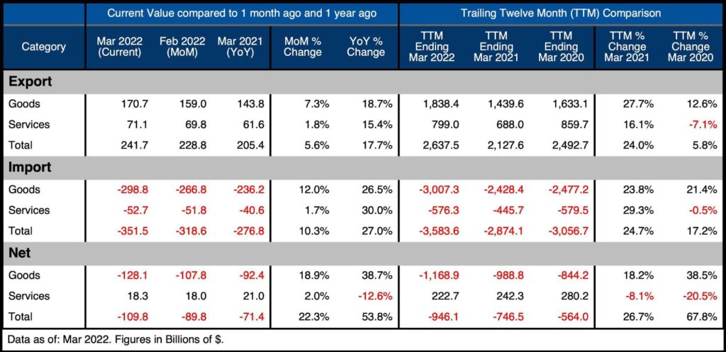
Figure: 2 Trade Balance Detail
Historical Perspective
Zooming out and focusing on the Net numbers shows the longer-term trend and shows the magnitude of the current move. The spike down on the far-right side shows how quickly the deficit has exploded. This plot also shows how much larger the Goods Deficit is compared to the Services Surplus. The Services Surplus has been declining since Jan 2018.
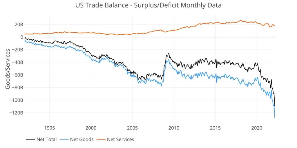
Figure: 3 Historical Net Trade Balance
The chart below zooms in on the Services Surplus to show the wild ride it has been on in recent months. It compares Net Services to Total Exported Services to show relative size. After hovering near 35% since 2013, it dropped to 24.9% in Oct 2021, recovered to 28%, but has fallen back down to 25.8%.
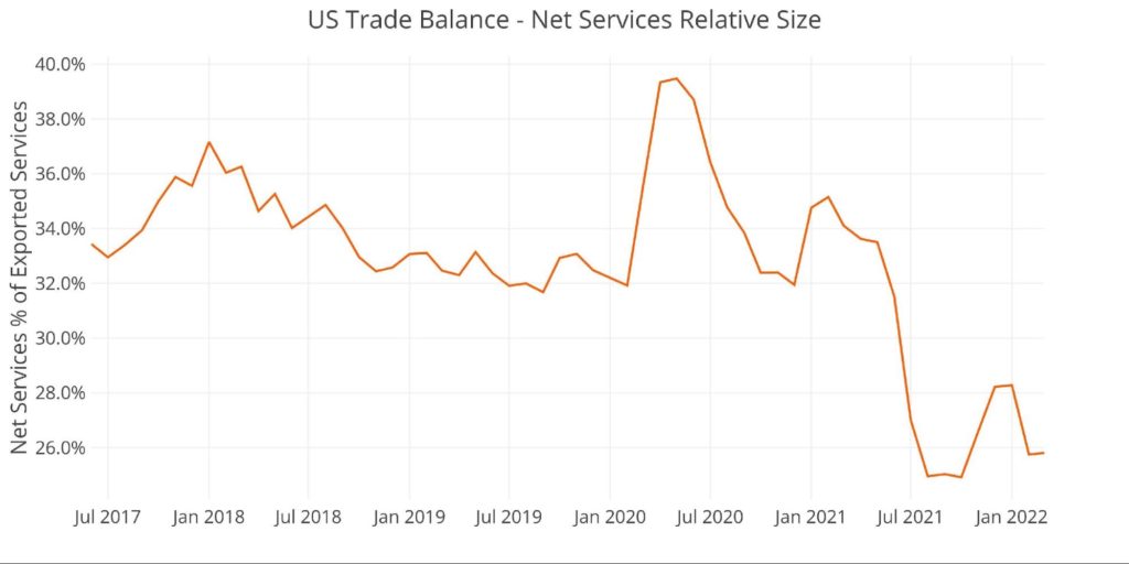
Figure: 4 Historical Services Surplus
To put it all together and remove some of the noise, the next plot below shows the Trailing Twelve Month (TTM) values for each month (i.e., each period represents the summation of the previous 12-months).
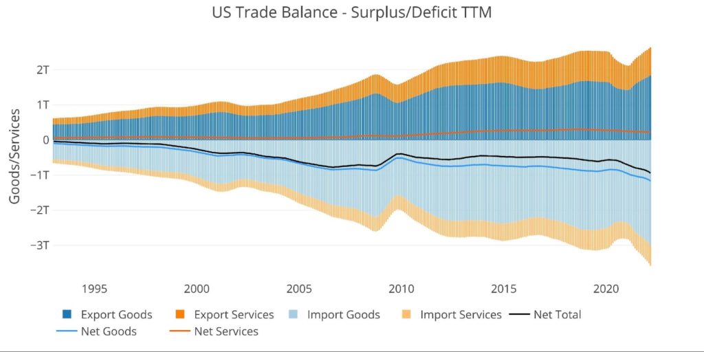
Figure: 5 Trailing 12 Months (TTM)
Although the Net Trade Deficits are hitting all-time records in dollar terms, it can be put in perspective by comparing the value to US GDP. As the chart below shows, the current records are still below the 2006 highs before the Great Financial Crisis.
That being said, the current 3.88% is the highest since April of 2009 and up from 2.93% in October.
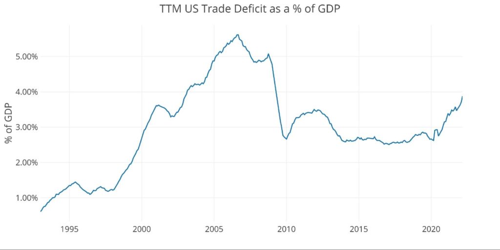
Figure: 6 TTM vs GDP
The chart below shows the YTD values. Because the current month is March, this chart only shows three months, but already 2022 is well above prior years by a significant margin.
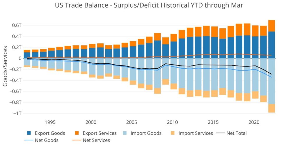
Figure: 7 Year to Date
What it means for Gold and Silver
Initially, the war between Ukraine and Russia could have put downward pressure on the trade deficit as the US banned imports from Russia. Unfortunately, the opposite has occurred and the trade deficit has completely exploded to new highs. This cannot last forever without imploding the US dollar.
The US continues to run massive deficits with its trading partners. How long will countries continue to accept paper dollars for physical goods? Eventually, the dollars being exchanged for goods will come flooding back to the US. This will likely exacerbate the inflation problem. Gold and silver offer excellent protection in such an environment.
Data Source: https://fred.stlouisfed.org/series/BOPGSTB
Data Updated: Monthly on one month lag
Last Updated: May 04, 2022, for Mar 2022
US Debt interactive charts and graphs can always be found on the Exploring Finance dashboard: https://exploringfinance.shinyapps.io/USDebt/


